
Last week a friend of mine commented on here about how she didn't know anything about how to start digiscrapping. And since I know that she's too lazy to get or read a book on it (love ya!) I wrote this up instead. Hopefully this will be easier than a book anyway!
Warning: this is going to be a very long post! :)
~~~~~~~~~~~~~~~~~~~~~~~~
Are you completely lost when it comes to digiscrapping? You don’t know where to begin? Maybe this will help! All you need is a very basic knowledge of Photoshop, a template, and a kit! I’m even going to teach you many of the basics in Photoshop so you don’t even really need that! J I’m going to teach you how to do a template cuz after you master those, you can branch out from there!
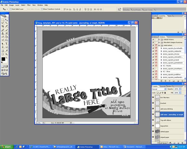
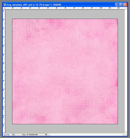
First open your .psd file template you would like to use in Photoshop. (Mine is from my template pack #1 sold only at Digital Candy.) All the layers you will see in the right lower corner. (Most template makers will label them with the type of item you should put there.) Here’s my screenshot! In order to follow some of the instructions in this tutorial, your template window should not be maximized, it should be it’s own window, like mine.
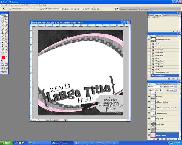
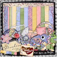
Next, decide a little of how you want to put this page together using the kit you have. I’m going to use my Lil’ Prima Kit (also sold only at Digital Candy) and I want the background to be black and the 3 oval papers are going to be pink.
Open the paper you want for your background. Make sure you have your “Move tool” selected:
and click and drag the background paper onto your template.
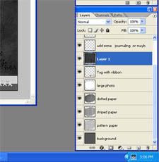
Now, because we’re working with layers here, my background paper landed in between a couple layers where it does not belong. But that’s okay. Over in your “layers” panel drag your selected layer down until it is directly above the “background layer”
to this ->
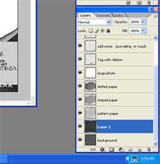
You may want to move the paper around on your screen also so that it covers the whole “background” Layer. Now press ctrl+e and that will make your paper the background layer.
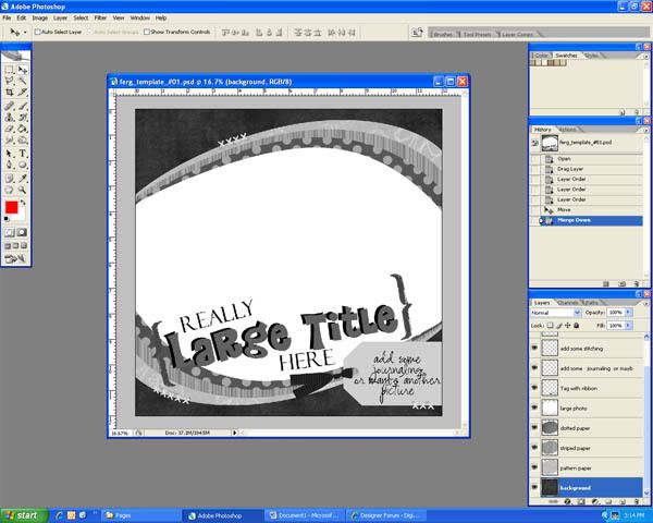
Here’s what we got so far:
Now for the patterned papers:
Go find the next paper you would like to use on the stack. I always work bottom to front just like you would on a paper layout. You start with the papers, then the photos, then the embellishments. The same way you moved the background paper, do it to the next paper. In the Layers Panel, drag the paper layer you’re using and place it directly above the layer you are replacing.
Right now, it is not in the shape of the oval paper I want it to replace so here’s how to make it that way. First press ctrl+alt+G which will make your paper the same shape as the layer under it. Next press ctrl+E to merge the layers together. Here’s what I have:
If you have more paper layers, continue these steps until all your paper has been placed. Here’s what I have now that my papers are done: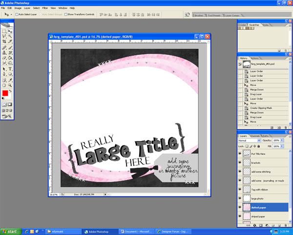
Now let’s go find the picture you want to use! Open it and drag it onto the template just like before and make sure it is put directly above the “photo” layer you want it on. Most likely your picture doesn’t exactly fit the photo space on your template so let’s fix that. In my case, my photo is much too small for the allotted space. First you’ll want to change the opacity of the photo to somewhere around 50%. Now press ctrl+t to transform your photo layer. 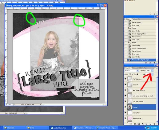
The red arrow is where you adjust the opacity and the green shows you that there are little squares all around your picture now.
If you put your cursor outside of the photo it will turn into a rounded arrow. That’s how you rotate it. If you put your cursor over one of the corner squares (and you’ll notice a double-sided arrow appear), hold down the shift key and drag the square out or in, that will change the size of the picture. It is important to hold the shift key so that your picture doesn’t become distorted! Since we made the photo transparent, it should be really easy to see how to transform it to make it fit the photo space.
Now change the opacity back to 100%. Press ctrl+alt+G then ctrl+E to “cut” the picture. J Alright, here’s where we are:
Let’s work on the tag and the stitches next.
Go find a tag either from the kit or from somewhere else so longs as it matches. If you don’t have a tag, don’t worry, you can put in any embellishment there that you like. I actually don’t want to use a tag, instead I’m going to put a cluster of flowers there. SO here I’m just going to delete the Tag and the journaling layer. I will open the flowers I want to use, drag them onto the page, put them in the correct layer order (above the picture), and push ctrl+T to transform them however will look good.
For the stitches I can look through my stash to see if there are any stitches I like. (stitches are real easy to come by so if you don’t have any, go get some. Alternately, you can keep the stitches already on the page and recolor them if you like) The stitches I chose are bigger than I need so I will have to cut them down. (most stitches are, other wise you’ll have to stack multiple single stitches beside each other) Open your stitches and drag them to your page. Zoom in to about 50 or 60% (just type in the number into this little box)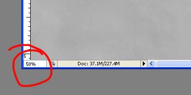
and choose your “polygonal lasso tool”.
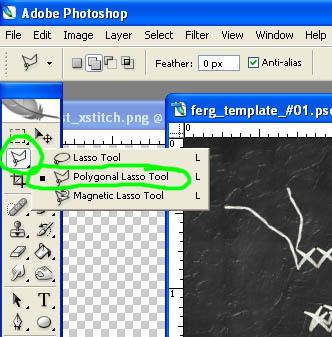
(If the other lasso is selected Press and hold the button until the menu comes up so that you can choose it. It needs to be the one with the jagged edges.)
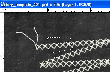
Now click around a few of the stitches and double click to close off the selection. Here’s mine:
From here you can either go to the edit menu and choose copy and then paste or you can right click inside the selection and choose “Layer via copy” when that’s done, choose your move tool again (the one with the 4 sided arrow) and you can move just those few stitches to wherever you want to put them. When you’re done with all the stitches on your page, delete the original stitching that doesn’t fit.
After you type, click on the move tool again so you can see the type (like I did there). I don’t like this font or size for this so I’m going to double click on the T-square in the layers panel on the right. That lets me edit it again. I’ll go find a font I like and set it to a size I want. (If you want a size bigger than 72, just type it in.) When it is how you want it, you can press ctrl+T if you’d like to rotate like I am going to do.
Since my type layer was the top layer, now the paper is on top and covering everything else. Now, while the new paper layer is selected in blue, you’re going to want to ctrl+click on the layer thumbnail of the Type Layer (the white box with the T). This will make marching ants appear where your title will be.
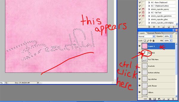
Now press ctrl+shift+I to select the inverse (you can also go to the select menu and choose “select inverse”) and press the delete button. This gives you a beautiful paper title! I want my title to stand out a bit more so I’m going to go back to my type layer, make it black, and offset it a little bit. I’m also going to add the rest of the title in regular type layers. Here’s what I have now:

Last but not least, we should add some shadows. I want to make a note here though. You can almost always tell who is a beginner digiscrapper because they almost always over emphasize their shadows! While shadows are very important, you have to remember to do it realistically. Here’s how to do a shadow. Select the layer you want to add a shadow too. I’m going to show you on one of the pink paper layers. Next, click on the little circle with an “f” in it at the bottom of your layers panel. Choose “drop shadow”. A box will show up. Move the box around until you have a good view of the bottom of your element at least. Adjust the distance and the size sliders until the shadow looks natural (and not too big). You may want to try just typing in numbers in those fields to get a more accurate setting. This screenshot shows you where the “f” (effects) button is located, the box that shows up, the sliders to adjust, and the shadow that is showing up:
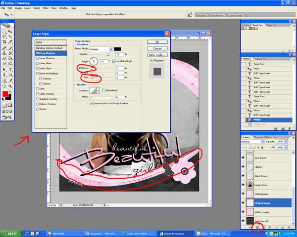
My distance is set to 5 and my size is set to 8, but this will vary from layout to layout or even element to element. If there is an element that would obviously be farther off the page than another, the shadow should go up to maybe 8 and 10 or something similar. Only you can decide what looks best for your page! When you’re satisfied, press OK. Finish the shadows for all you other elements that you want to have shadows on.
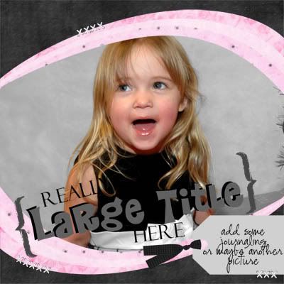
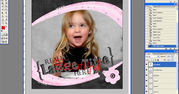
Now you’re done! Congratulations! Save your layout both as a .psd file (so you can edit it later if you need to) and a .jpg file so you can send it to a photo lab at some point. If you want to be able to put it into a gallery online, you’ll need to resize it. Go to the image menu and choose “image size”. Set the resolution to 72 and the width to 600 (the height should automatically adjust). Now save it as a .jpg but add “web” to the end of your filename.You have a great new Layout!!! Here’s mine:


6 comments:
Thanks for the great tut, Maria! I learned a few new things...
holy camoly - this is GREAT well done girl!!
Great tut, Maria! I love how you did the "big" Beautiful! Great info!
Thanks for the great tutorial. A lot of great tips. See the layout I did while following your steps, on my blog. :)
AWESOME info Maria!!! Ok I guess now I can give it a shot...
Thank you so much or this tutorial. It was really well explained.
Post a Comment