Showing posts with label Easy Does It. Show all posts

Thursday, August 7, 2008

Creating your own Templates: intermediate level

This was a request at digital candy and it took me a little longer than I planned to get it up... sorry! ;)

So I'll get right into it:

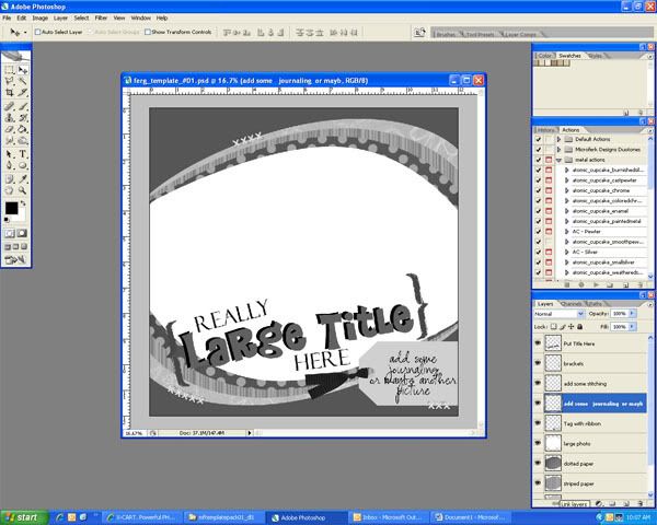
When you are done making a layout (and after you’ve saved it), make sure all the pieces are still in their own layers. This is a layout I made based on a layout or sketch in a print magazine. I never made a template from it before, but I know there is one out there that it similar to it. At the end of this tutorial, I’ll package up the template I made and give it to you all for free!

So, the first thing I do is get rid of all my shadows and layers I am not going to need. In this case, I realized I saved this file originally with a lot of hidden layers and copied layers. Plus I don’t need the layers that say the ages since I know that words are going to go there.

Next you need to make the spaces for photos. Click on one of your photos in the layers pallette. Go to image > Adjustments > Hue/Saturation. Move the lightness slider all the way to the right to make the “photo” completely white. I also usually stroke the photo with black so it’s easier to see where the photo goes. This will be important in some cases, and not as important in other cases. Do these steps for all of the photos on your layout. This is where we are now:


Next, let’s work on the papers. First, let’s make the background. For this layout, I’m going to make the background paper be solid. You can decide to make all your papers solid (which is easier) or you can decide which papers should be patterned if it matters to you. I’ll make some of my papers patterned later.

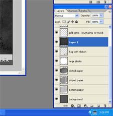
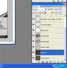
First, choose your background layer, then make it a selection by pressing ctrl+a or ctrl while clicking the thumbnail of the layer. Then, make a new layer. Choose a solid color. I always use a grey-toned color, but that is up to you. Fill your selection in the new layer with the color you chose. Deselect and remember to delete your original background layer. Here’s what mine looks like now:

Now, I’m going to do make all my other solid papers into solid colors. Again, I will choose the layer, then ctrl+click on the thumbnail of the layer, make a new layer, and fill the selection with a grey-toned color, then deselect and delete the original layer. Remember that this color should be different from your background so it doesn’t blend together. Don’t forget to take some time out to label your layers. I’m naming them according to what I am supposed to put there, ie. Dark solid paper, striped paper, etc.

Now, we’re going to do some patterned papers. The first one we’ll do is striped. Find a patterned paper in your layout and choose it in the palette. Now you are going to have to make a new document. It only has to be about an inch square. Choose your rectangle marquis tool and choose the left half of the document. Fill with a solid color. Then hit ctrl+shift+i to get the other side of the document. Fill that side with a different solid color. This is what it should look like:


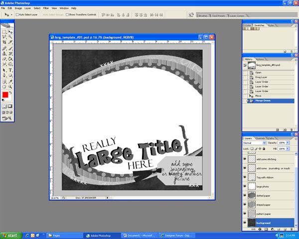
Now go to edit > define pattern and click okay when the dialogue box comes up. Now, close that document without saving. Now that you’re back at your layout/template file, go to layer > new fill layer > pattern and again choose okay and then another dialogue box will show up. I usually only need to adjust the scale at this point. When it looks the way you like it, click okay. Right-click on the pattern fill layer in the layers palette and choose rasterize. Then, (making sure this layer is directly above the one you want to replace) hit ctrl+shift+g to create a clipping mask. Then hit ctrl+e to merge the pattern down. Rename the layer if you need to.

My screenshots decided to quit working so I will upload screenshots another time.

You can also make other kinds of patterns in the same way we made the stripes. Try placing a circle in the middle of the document next time, or play around in other ways! Here’s my page now that all my patterned papers are replaced:


Now I’m going to replace some of the elements. These are usually pretty easy. If there are embellishments, one thing you can do that is easy is delete the embellishment and put an X in its place. Ribbons can be solid colors just like papers. Staples can simply be drawn-in straight lines. Stitching can just be x’s or lines or doodling where the stitching should be, etc. On this layout, I have a curved fiber that I will simply draw over on another layer to replace it. I will also make lines with the line tool for stitching, and I will also simply fill the ribbons with a solid color. (I’ll also take the time to remind you again to label your layers every time.) Here’s what it looks like now:


Lastly we’re going to change the title and journaling, and also label the photos. So make a text Layer over top of your title. Put “your Title” or “Title goes here” or whatever fits on your layer. I’m going to put “title Here” and “title” will go where “first” is and “Here” will go where it says “Year” right now. Generally you can do this in black. I also have a little journaling place that says Elliott right now, but I will change that to “date/name”. Also make your photo labels. When you’re done with all this, remember to rasterize the text layers. I usually merge the text layers all into one layer so it saves on files space, then rename it “delete me” or something of the like.

And Voila! Here's your new template! click on the image to get this one I made special for you guys!


Have fun now making your own templates!

Thursday, June 26, 2008

Easy Does It - Quickpage Making (beginner to intermediate)

I know it has been an awful long time since I've posted a tutorial on here! I'm so sorry! Beleive me though, I've been working my heiny off to get more products and sales to you guys. I have a whole slew of things in store for you in the near future!

In the meantime, here's a tut I wrote up for you on making quickpages!

********************************************

Are you new to QuickPage making? Have you made a couple but didn’t really get the shadows right? Well here’s how I do it…

First Scrap a regular page but use white rectangles for the photos. You can make them any size you want, or you can make them standard sizes like 4x6 or 5x7. Then apply all the shadows to every element and paper you think needs a shadow. Here’s what I have after all this:

All the layers are still separated at this point. You should save your .psd file at this point so you have it in case you need it again. Now, in the layers palette, select the bottom-most photo (in my case, I only have one), and also every layer below it. Right click and select “Merge Layers”.


Now go grab your magic wand tool (or press W) and click on the white area that is the photo. You should see marching ants around where the whole photo is.


Go ahead and delete it so now you see a hole where the white “photo” used to be.

If you have more pictures, go to the new bottom-most picture, select it and every layer below it, merge, and cut out the white. Continue to do this until all your pictures have a hole there. You must start from the bottom photo and work your self upward in order to get the shadows right!


When you get done, you can select all layers, right-click, and choose merge layers. DO NOT choose flatten image as it will fill your pictures in with white again.

Voila! A beautiful new Quickpage!


Wednesday, May 21, 2008

Easy Does It - Every experience level

This Tutorial is for planning and organizing an album!

I want to say right from the get that I did not come up with this way of doing things. I learned most of it from someone else's blog back when I first started digiscrapping (I was not yet good at keeping track of things) but I have searched and searched for it again and cannot find it! So if it is you, or if you know the person who did this originally, please let me know so I can credit the right person!

In the meantime, I’m going to write it up and re-post in my own words here because this technique has helped me invaluably!

This is for all you scrappers who scrap out of order and whatever you feel like and then never turn anything into an actual album because nothing is completed! Lol I know you are out there! I was one of them!

~~~~~~~~~~~~~~~

First thing you need to do is decide how many pages you’re looking for in an album. You can always revise this number but its good to have a reference point so you don’t go overboard. I chose to have 50 pages with the first and last left blank (for the inside front and back covers), therefore I will only make 48 layouts.

Then, I went to the folder that holds all my sons first year photos. It was easiest for me to make a new folder named “to scrap”. Then I went through all the pictures I had of him from his first year. All the ones I wanted to scrap I copied into the “to scrap” folder. (Do not move these photos because you don’t want to accidentally lose or misplace them.)

After you have chosen a slew of photos and copied them into the “to scrap” folder, the next step is to sort the pictures to scrap. As you go through the pictures to scrap, separate them into groups which you might include on the same layout. Put them in a new folder labeled with the preliminary layout name you may chose. Here’s a screen shot of a bunch of my folders I have organized (note: at this time the majority of my layouts are completed and I have removed the folders containing pictures of completed layouts):


Now open Photoshop. Create a new document. The length of the document should be half of the number of pages you want in your album. For instance, my new document is 25 inches tall and 2 inches wide at 300 dpi. There will be 2 pages side by side just as in an album. This makes it easy to see what your album will look like in the end. Here’s my strip:


In order to make it easier to place your layouts in the correct positions, I am going to make checkered gray squares where my pages will be. Choose your square marquis tool by pressing M. At the top of the screen, change the style to fixed size and set it to 300 px x 300 px. Click anywhere on the strip and a little marching ants box should show up. Go to Layer > New… > Layer (or press shift+ctrl+N). Then select your paint bucket tool and choose a very light shade of grey. Click inside your marching ants to make a small gray square. Here’s mine:


Move that box into the top left corner (it should snap into place perfectly, if not, the 2 edges should exactly be touching the side of the document). Duplicate that layer and move the duplicate down and to the right so that just the corners are touching. Keep doing this until you have checkered your whole strip. Here’s what mine looks like now:


Now, zoom in to 75-100% and start naming the pages and putting them in the order you want. Make sure these correspond with the layout folders you created earlier. Here’s a little bit of my preview strip with layout labels. The top row are single page layouts and the second 2 rows are double page layouts.


After you’ve labeled every page you can start making your layouts in any order you feel inspired for but at least you’ll be working toward a goal. When you’re done creating a layout and after you’ve saved your .psd file, 3600x3600 .jpg file, and a 600x600 web .jpg file, resize your image to 300 by 300 pixels. Then drag it onto your preview strip in the square it belongs to covering up your label. Here’s what mine looks like at this moment:

So I hope this has helped you as much as it has helped me! Happy Scrappin!

Thursday, May 15, 2008

Easy Does It?

Well, I have had absolutely no time to write up a tutorial! So sorry! But I do have a good excuse!!

I do! I promise!

You want to know it??? Alright, since I do owe you for having grace on me about not having a tutorial... :) I was making a MASSIVE kit!! and it's GORGEOUS!!! It's so huge, in fact, that I had to split it up into 2 kits! Just to give you an idea, the *Add-on Pack* is as big as my Mod Turtle Kit!

This Kit and it's add-on will be in the store tomorrow morning! And there will be a juicy sale so You'll have to check back here to see what it is!!!

Here is the previews for both the kit and the add-on!


Alright, here's something else that is REALLY JUICY TOO! Do you want to WIN this whole kit FREE?!?!?! Here's what you do, Subscribe to this blog! that's it! just find the subscribe widget on the left of this blog, put in your email and click subscribe! ONE SUBSCRIBER will receive this whole kit free!!! And every subscriber will receive a gift! So go find the Subscription Box, and Subscribe to our blog! That way, you'll NEVER miss a challenge or new release or sale!

In other news: I thought it would be nice to showcase a little of what my CT members have been doing this month! I really have a GREAT CT so here is a little something from everyone! (click the layouts to see the credits and to leave some love!)

Thursday, May 8, 2008

Easy Does It! - Beginner's

Welcome to the weekly edition of Easy Does It!, a tutorial based in Photoshop which is posted every week! This week I'm going to focus on the most basic of basic digiscrapping: How to get started. This includes how to use some basic functions of photoshop if that is new to you also.

Last week a friend of mine commented on here about how she didn't know anything about how to start digiscrapping. And since I know that she's too lazy to get or read a book on it (love ya!) I wrote this up instead. Hopefully this will be easier than a book anyway!

Warning: this is going to be a very long post! :)

~~~~~~~~~~~~~~~~~~~~~~~~

Are you completely lost when it comes to digiscrapping? You don’t know where to begin? Maybe this will help! All you need is a very basic knowledge of Photoshop, a template, and a kit! I’m even going to teach you many of the basics in Photoshop so you don’t even really need that! J I’m going to teach you how to do a template cuz after you master those, you can branch out from there!

Here we go!

~~~~~~~~~~~~~~~~~~~~~~~~

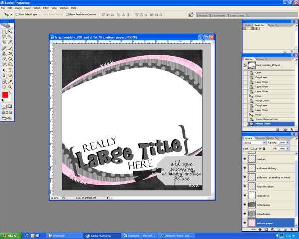
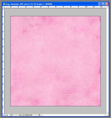
First open your .psd file template you would like to use in Photoshop. (Mine is from my template pack #1 sold only at Digital Candy.) All the layers you will see in the right lower corner. (Most template makers will label them with the type of item you should put there.) Here’s my screenshot! In order to follow some of the instructions in this tutorial, your template window should not be maximized, it should be it’s own window, like mine.


Next, decide a little of how you want to put this page together using the kit you have. I’m going to use my Lil’ Prima Kit (also sold only at Digital Candy) and I want the background to be black and the 3 oval papers are going to be pink.

Open the paper you want for your background. Make sure you have your “Move tool” selected:


and click and drag the background paper onto your template.

Now, because we’re working with layers here, my background paper landed in between a couple layers where it does not belong. But that’s okay. Over in your “layers” panel drag your selected layer down until it is directly above the “background layer”


to this ->


You may want to move the paper around on your screen also so that it covers the whole “background” Layer. Now press ctrl+e and that will make your paper the background layer.

Here’s what we got so far:


Now for the patterned papers:

Go find the next paper you would like to use on the stack. I always work bottom to front just like you would on a paper layout. You start with the papers, then the photos, then the embellishments. The same way you moved the background paper, do it to the next paper. In the Layers Panel, drag the paper layer you’re using and place it directly above the layer you are replacing.

Right now, it is not in the shape of the oval paper I want it to replace so here’s how to make it that way. First press ctrl+alt+G which will make your paper the same shape as the layer under it. Next press ctrl+E to merge the layers together. Here’s what I have:


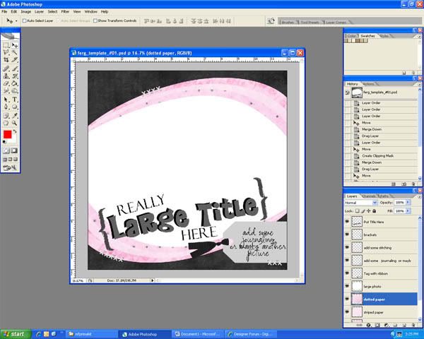
If you have more paper layers, continue these steps until all your paper has been placed. Here’s what I have now that my papers are done:


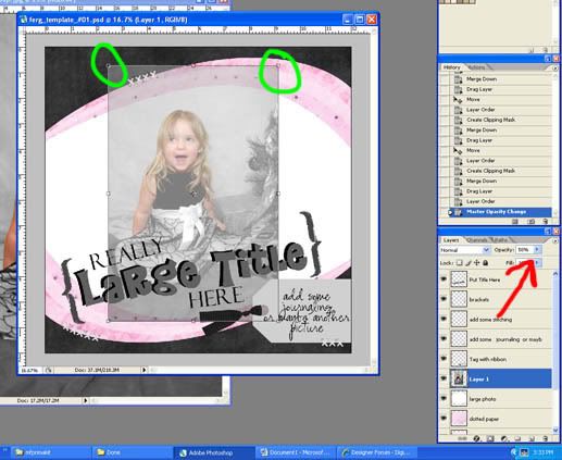
Now let’s go find the picture you want to use! Open it and drag it onto the template just like before and make sure it is put directly above the “photo” layer you want it on. Most likely your picture doesn’t exactly fit the photo space on your template so let’s fix that. In my case, my photo is much too small for the allotted space. First you’ll want to change the opacity of the photo to somewhere around 50%. Now press ctrl+t to transform your photo layer.


The red arrow is where you adjust the opacity and the green shows you that there are little squares all around your picture now.


If you put your cursor outside of the photo it will turn into a rounded arrow. That’s how you rotate it. If you put your cursor over one of the corner squares (and you’ll notice a double-sided arrow appear), hold down the shift key and drag the square out or in, that will change the size of the picture. It is important to hold the shift key so that your picture doesn’t become distorted! Since we made the photo transparent, it should be really easy to see how to transform it to make it fit the photo space.


Now change the opacity back to 100%. Press ctrl+alt+G then ctrl+E to “cut” the picture. J Alright, here’s where we are:


Let’s work on the tag and the stitches next.

Go find a tag either from the kit or from somewhere else so longs as it matches. If you don’t have a tag, don’t worry, you can put in any embellishment there that you like. I actually don’t want to use a tag, instead I’m going to put a cluster of flowers there. SO here I’m just going to delete the Tag and the journaling layer. I will open the flowers I want to use, drag them onto the page, put them in the correct layer order (above the picture), and push ctrl+T to transform them however will look good.

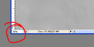
For the stitches I can look through my stash to see if there are any stitches I like. (stitches are real easy to come by so if you don’t have any, go get some. Alternately, you can keep the stitches already on the page and recolor them if you like) The stitches I chose are bigger than I need so I will have to cut them down. (most stitches are, other wise you’ll have to stack multiple single stitches beside each other) Open your stitches and drag them to your page. Zoom in to about 50 or 60% (just type in the number into this little box)


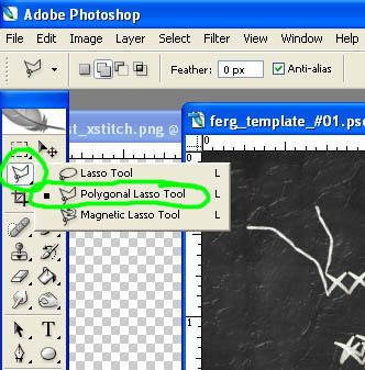
and choose your “polygonal lasso tool”.


(If the other lasso is selected Press and hold the button until the menu comes up so that you can choose it. It needs to be the one with the jagged edges.)

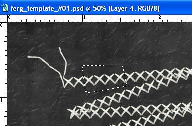
Now click around a few of the stitches and double click to close off the selection. Here’s mine:


From here you can either go to the edit menu and choose copy and then paste or you can right click inside the selection and choose “Layer via copy” when that’s done, choose your move tool again (the one with the 4 sided arrow) and you can move just those few stitches to wherever you want to put them. When you’re done with all the stitches on your page, delete the original stitching that doesn’t fit.

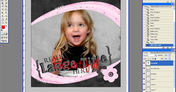
Alright, On to the Title. I will show you one of the easiest yet one of my favorite ways to do the title. Go select the Type tool (The one with the T on it) Click and drag a large square (or about the size that your title should be) At the top of the screen, choose the font you want and a size. You can adjust these after you start typing. Type in one part of your title. My Title is going to be Beautiful, Beautiful girl but the second beautiful is going to be the large word so that’s what I’ll focus on here.


After you type, click on the move tool again so you can see the type (like I did there). I don’t like this font or size for this so I’m going to double click on the T-square in the layers panel on the right. That lets me edit it again. I’ll go find a font I like and set it to a size I want. (If you want a size bigger than 72, just type it in.) When it is how you want it, you can press ctrl+T if you’d like to rotate like I am going to do.

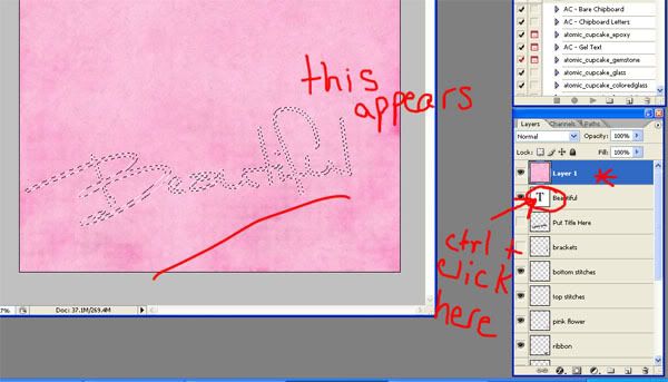
Now you can either choose a font color you like and leave it at that, or you can do what I like to do: “cut paper” into the title. SO open the paper you’d like to use for the title and drag it onto your layout. The edges should not extend farther than the canvas. Place you new paper layer directly on top of the type layer of the title. Like this:


Since my type layer was the top layer, now the paper is on top and covering everything else. Now, while the new paper layer is selected in blue, you’re going to want to ctrl+click on the layer thumbnail of the Type Layer (the white box with the T). This will make marching ants appear where your title will be.


Now press ctrl+shift+I to select the inverse (you can also go to the select menu and choose “select inverse”) and press the delete button. This gives you a beautiful paper title! I want my title to stand out a bit more so I’m going to go back to my type layer, make it black, and offset it a little bit. I’m also going to add the rest of the title in regular type layers. Here’s what I have now:


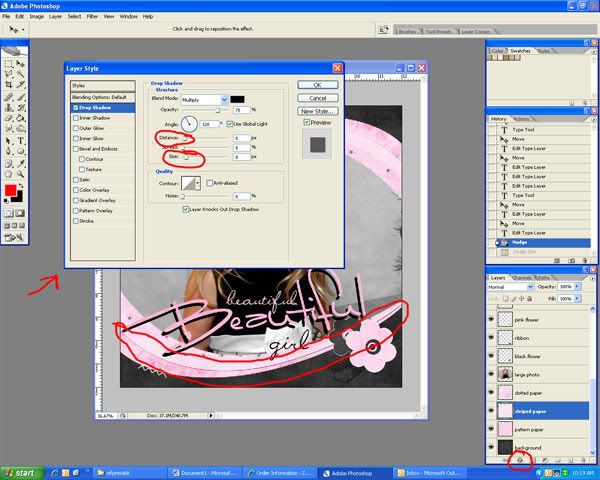
Last but not least, we should add some shadows. I want to make a note here though. You can almost always tell who is a beginner digiscrapper because they almost always over emphasize their shadows! While shadows are very important, you have to remember to do it realistically. Here’s how to do a shadow. Select the layer you want to add a shadow too. I’m going to show you on one of the pink paper layers. Next, click on the little circle with an “f” in it at the bottom of your layers panel. Choose “drop shadow”. A box will show up. Move the box around until you have a good view of the bottom of your element at least. Adjust the distance and the size sliders until the shadow looks natural (and not too big). You may want to try just typing in numbers in those fields to get a more accurate setting. This screenshot shows you where the “f” (effects) button is located, the box that shows up, the sliders to adjust, and the shadow that is showing up:


My distance is set to 5 and my size is set to 8, but this will vary from layout to layout or even element to element. If there is an element that would obviously be farther off the page than another, the shadow should go up to maybe 8 and 10 or something similar. Only you can decide what looks best for your page! When you’re satisfied, press OK. Finish the shadows for all you other elements that you want to have shadows on.


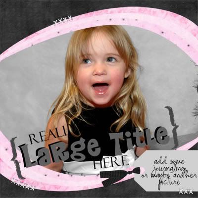
Now you’re done! Congratulations! Save your layout both as a .psd file (so you can edit it later if you need to) and a .jpg file so you can send it to a photo lab at some point. If you want to be able to put it into a gallery online, you’ll need to resize it. Go to the image menu and choose “image size”. Set the resolution to 72 and the width to 600 (the height should automatically adjust). Now save it as a .jpg but add “web” to the end of your filename.You have a great new Layout!!! Here’s mine:


Wednesday, April 30, 2008

Easy Does It!

Hey All! I'm SO excited today! This post was actually supposed to have been up WAY earlier this morning but things have been a bit hectic over here!

I JUST found out that the store WILL be open tonight some time and when it does, I'm immediately posting a blog here so please come back and check things out! (There will be enough info in the blog to warrant you coming back, trust me!)

In the meantime, I put together a NEW freebie for you that hasn't hit the store yet. Here is the Pewter Tile Alpha freebie! It is only the capital letters but when it hits the store I will have added lowercase and numbers to the set. (sorry, this link has expired) This freebie will ONLY be available until tomorrow morning (May 1st) so get it quick!


Now for Today's event: Easy Does It! This will be a weekly tutorial posted on Wednesday's blog! Except that for today I didn't have time to write a new tutorial (on account of getting things ready for the store opening) but maybe you all haven't done a whole lot of exploring here on this blog so I'm directing you to an old tutorial of mine here: http://fergdesigns.blogspot.com/2008/03/extraction-tutorial.html

And of course there's a chance for a prize today too!!! All you have to do is create a layout using something you learned from my tutorial, Post the Layout at Digital Candy, and Link up back here on THIS post! One random commenter with a layout will recieve $1.00 off my store!

That's Not all!!! (you knew I was going to say that, didn't you?) IF the winner chosen used products from me (Ferg Designs) in their layout, they will recieve twice that amount to be used in my store! How fantabulous is that?!?!

The deadline for submission is Saturday, May 3 at 11:59 PM Pacific Time!

Also Don't forget to participate in the other challenges we have going on this week too. Carey's Ready, Set, Go Layout is due by tomorrow night so get them in!!!

Alright Ladies! See you tonight!!! Yeee-Haaaaa!

Friday, March 21, 2008

Extraction Tutorial

I wrote this tutorial today for a gal at Digital Candy so I thought I would post it here too. It was fun to write so maybe I'll do a few more soon too!


Alright, This is done using PSCS2 but the concepts are there so you should be able to do this no matter what program you are using.


First, Open your image. I'm using this one of a bride and groom walking down the street.


Next, make 2 duplicate copies and name them "original" and "working". Make the original layer invisible. This is just an insurance layer in case something goes wrong. on the bottom layer, fill it with one whole solid color. If you know what color you will be placing the extracted photo on, use a color that matches that the best. Your setup should look like this.


Zoom your picture WAY in. mine here is at 200% but it depends on your picture. Next, choose the Polygonal Lasso Tool. I have found that I have the most control with this tool rather than the regular lasso or the magic wand. If you find another tool easier to use, then use that one. You will want to choose a feather amount. This number willchange from picture to picture. I used 1px feather for this one. To choose the best size feather, just follow the next couple of steps and undo it if it doesn't look right. you will probably not get the best results when the feather is set to zero.


Now, little by little, start making small selections. start someplace that is easy to discern and follow the path along the object. (with the polyganal lasso, you will have to make numerous clicks along the way) after you've followed the object for a little ways, close off the selection. Here's what mine looked like at this point.


Delete the area and you should come up with something like this:


Notice that there is a little bit of darkness between the man's shirt and the white background. here I just need to go back and make my selection a little closer to the shirt and delete it again. It's always best to err on the side of not being close enough than to have cut off too much in the first place.


Here is my pic after this fine-tuning. Continue around the rest of the picture just deleting bits and pieces and fine-tuning either as you go and/or when you're finished.


Here is my extraction after the rest of the pic has been deleted.


Now Add your extraction to your page. I put this pic out of the paper a little so it doesn't look like they are walking on thin air (as much anyway).Remember, this may take lots of practice before it looks really realistic but keep playing around with the different settings and zoom levels and you will get it!